There are two kinds of computer graphics - raster (composed of pixels) and vectorbitmap
(composed of paths). Raster images are more commonly called
A bitmap image uses a grid of individual pixels where each pixel can be a different color or shade. Bitmaps are composed of pixels.
Vector graphics use mathematical relationships between points and the paths connecting them to describe an image. Vector graphics are composed of paths.
The image to the left below is representative of a bitmap and the image to the right is representative of a vector graphic. They are shown at four times actual size to exaggerate the fact that the edges of a bitmap become jagged as it is scaled up: images.
Bitmap Image: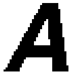 | Vector Graphic: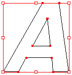 |
With Adobe® Systems' introduction of the PostScript® page-description language computers could display fonts and images using point-to-point math rather than by pixels alone. The advantage to using a page-description language such as PostScript becomes clear when you scale an image up. The larger you display a bitmap, the more jagged it appears, while a vector image remains smooth at any size. That is why PostScript and TrueType® fonts always appear smooth - they are vector-based.
The jagged appearance of bitmap images can be partially overcome with the use of "anti-aliasing". Anti-aliasing is the application of subtle transitions in the pixels along the edges of images to minimize the jagged effect (below left). A scalable vector image will always appear smooth (below right):
Anti-Aliased Bitmap Image: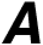 | Smooth Vector Image: |
Bitmap images require higher resolutions and anti-aliasing for a smooth appearance. Vector-based graphics on the other hand are mathematically described and appear smooth at any size or resolution.
Bitmaps are best used for photographs and images with subtle shading. Graphics best suited for the vector format are page layout, type, line art or illustrations.
Wherever possible use the vector format for all your type, line art and illustrations and only use bitmaps for photos or images with complex or non-uniform shading. If the graphics application recognizes native vector files such as those created by Deneba Canvas™ (a filename with an extension of .CNV- for versions 6 and 7), Adobe Illustrator® (a filename with an extension of .AI), CorelDRAW® (a filename with an extension of .CDR), or Macromedia® FreeHand® (a filename with an extension of .FH8 - for version 8), then use them first.
The EPS File Format
If the graphics application you are using cannot read native vector files the next best thing would be to save them as EPS (Encapsulated PostScript) files. These are self-contained PostScript files which contain the same mathematical descriptions as the vector files they are made from. Even bitmaps can be saved in the EPS file format. EPS files are supported by most all graphics applications. It is the most portable format for this reason. It is best to use EPS files for all line art and illustrations because they can be reproduced at any size or resolution and still display exactly as they were drawn. Use them wherever native vector files cannot be used.
A Little of Both In Today's Applications
Today's graphic artist has to master both skills - image editing and illustration. In fact, Adobe Photoshop® - an image editor - incorporates vector based paths which can be exported as native vector files. Four of the major illustration programs - Deneba Canvas, Adobe Illustrator, CorelDRAW and Macromedia Freehand - allow bitmaps to be embedded in the vector files they create.
I believe that the ideal page layout program of the future would be primarily a vector-based application which would create, import, display and print native vector objects side by side with bitmaps. As computing power becomes more affordable I believe this will happen.There are many graphic image file formats - more than necessary to list here. The most frequently used ones are listed below:
| Note: The file formats listed below do not include the proprietary file formats created by the graphics applications when you save files. |
For Web Pages:
GIF - Graphics Interchange Format - Images using a fixed color palette (limited to only 256 colors - not the full spectrum of colors available to your monitor). The GIF format uses compression for smaller files and faster downloads. This format is best for images with solid colors or areas of uniform color such as illustrations and logos.
JPEG - Joint Photographic Experts Group - Used for photographic (continuous tone) images. Unlike GIF files the JPEG format can take advantage of the full spectrum of colors available to your monitor. The JPEG format also uses compression for smaller files and faster downloads. However, unlike the compression method used in GIF files, the JPEG compression is "lossy" which means it discards data in the process. Once a file is saved in JPEG format the data is permanently lost. If you want all the image data available for future use, save the image using no compression or "lossless" compression and make JPEG copies from it.
For Printed Documents:
TIFF - Tagged-Image File Format - Used for bitmaps only. The TIFF format is supported by virtually all graphics applications.
EPS - Encapsulated PostScript® - A file format used for both vector graphics and bitmaps. EPS files contain a PostScript description of the graphic data within them. EPS files are unique in that you can use them for vector graphics, bitmap images, type or even entire pages.
Finished documents fall roughly into two categories:
1. Printed documents - brochures, catalogs...anything printed...desktop publishing
2. Electronic documents - web pages and PDFs (see below)
The Importance of Planning
Although finished images for both media are prepared very differently, the same software is used for both. Because of this you have an opportunity to utilize the same artwork - if you plan ahead.
For example you might design a logo and prepare stationery and business cards for a client. You may be able to get away with a bitmap version of the logo, but you may have to redraw it as a vector image later when the client asks you to build a web page or create a sales brochure. Once you've got your client's attention do him a favor and point out all the ways he can utilize the artwork you'll be preparing for him. Then you can better plan the project before you start. Explain that by using this "open ended" approach he'll have more options in the future. Most clients will appreciate your pointing out these facts at the beginning.
Adobe® Portable Document Format (PDF)
The Adobe Portable Document Format (PDF) is used for publishing electronic documents to be distributed over the Internet and other online services. The advantages to PDF files are:1. Their compact size...making them ideal for distributing product brochures and technical manuals over the Internet.
2. They are platform independent - they work with both Mac® and PC computers.
3. The software used to read and print them is free.
4. They display and print using the PostScript® page-description language. That means if line art is embedded as vector objects, it will display and print perfectly at any size or resolution. Plus it can be extracted and placed into illustration documents or bitmap images.
5. Fonts are embedded within them so the target computer does not have to have the fonts installed to view them.
6. They are fully searchable.
7. They can contain hyperlinks to pages within the PDF document itself or to a web page on the Internet - or to movie clips.
8. They contain PostScript® data and can be imported into both image editors and illustration programs just like EPS files.
9. Vector art contained in the PDF file will make PERFECT printed output at any resolution - just as if the output were being printed from a job saved as a PostScript .PS or .PRN file. If there are embedded bitmaps they will usually be downsampled to 72 pixels per inch for viewing on a monitor or for transporting over the Internet. This is to keep their file size small. However, bitmaps can be embedded at high resolution for high-end output.
Color Models
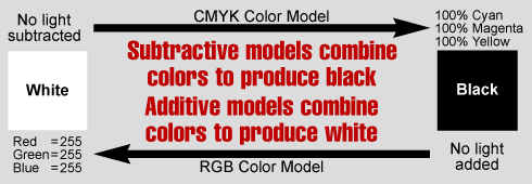
A color model is an orderly system for creating a whole range of colors from a small set of primary colors. There are two types of color models, those that are subtractive and those that are additive. Additive color models use light to display color while subtractive models use printing inks. Colors perceived in additive models are the result of transmitted light. Colors perceived in subtractive models are the result of reflected light.
The Two Most Common Color Models
There are several established color models used in computer graphics, but the two most common are the RGB model (Red-Green-Blue) for computer display and the CMYK model (Cyan-Magenta-Yellow-blacK) for printing.
| RGB Color Model Additive color model For computer displays Uses light to display color Colors result from transmitted light Red+Green+Blue=White 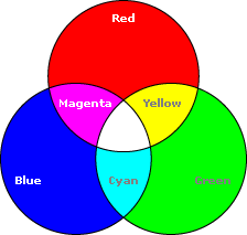 | CMYK Color Model Subtractive color model For printed material Uses ink to display color Colors result from reflected light Cyan+Magenta+Yellow=Black 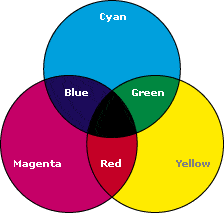 |
Notice the centers of the two color charts. In the RGB model, the convergence of the three primary additive colors produces white. In the CMYK model, the convergence of the three primary subtractive colors produces black.
In the RGB model notice that the overlapping of additive colors (red, green and blue) results in subtractive colors (cyan, magenta and yellow). In the CMYK model notice that the overlapping of subtractive colors (cyan, magenta and yellow) results in additive colors (red, green and blue).
Also notice that the colors in the RGB model are much brighter than the colors in the CMYK model. It is possible to attain a much larger percentage of the visible spectrum with the RGB model. That is because the RGB model uses transmitted light while the CMYK model uses reflected light. The muted appearance of the CMYK model demonstrates the limitation of printing inks and the nature of reflected light. The colors in this chart appear muted because they are displayed within their printable gamut (see below).
Additive vs. Subtractive Color Models
Since additive color models display color as a result of light being transmitted (added) the total absence of light would be perceived as black. Subtractive color models display color as a result of light being absorbed (subtracted) by the printing inks. As more ink is added, less and less light is reflected. Where there is a total absence of ink the resulting light being reflected (from a white surface) would be perceived as white.
 |
Each color model has is own gamut (range) of colors that can be displayed or printed. Each color model is limited to only a portion of the visible spectrum. Since a color model has a particular range of available color or gamut, it is referred to as using a "color space". An image or vector graphic is said to use either the RGB color space or the CMYK color space (or the color space of another color model). Some graphic applications present the user with more than one color model for image editing or illustration and it is important to choose the right one for the task. The whole point of this article is to explain the difference between the two color models so you choose the right one for the job. For you work to display at its best, choosing the right color model is critical.
RGB Color
The RGB model forms its gamut from the primary additive colors of red, green and blue. When red, green and blue light is combined it forms white. Computers generally display RGB using 24-bit color. In the 24-bit RGB color model there are 256 variations for each of the additive colors of red, green and blue. Therefore there are 16,777,216 possible colors (256 reds x 256 greens x 256 blues) in the 24-bit RGB color model.
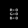
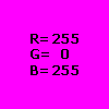
In the RGB color model, colors are represented by varying intensities of red, green and blue light. The intensity of each of the red, green and blue components are represented on a scale from 0 to 255 with 0 being the least intensity (no light emitted) to 255 (maximum intensity). For example in the above RGB chart the magenta color would be R=255 G=0 B=255. Black would be R=0 G=0 B=0 (a total absence of light).
CMYK or "Process Color"
The CMYK printing method is also known as "four-color process" or simply "process" color. All of the colors in the printable portion of the color spectrum can be achieved by overlapping "tints" of cyan, magenta, yellow and black inks. A tint is a screen of tiny dots appearing as a percentage of a solid color. When various tints of the four colors are printed in overlapping patterns it gives the illusion of continuous tones - like a photograph:
| The CMYK model forms its gamut from the primary subtractive colors of cyan, magenta and yellow. When cyan, magenta and yellow inks are combined it forms black - in theory. However, because of the impurities in ink, when cyan, magenta and yellow inks are combined it produces a muddy brown color. Black ink is added to this system to compensate for these impurities. |  |
In the CMYK color model, colors are represented as percentages of cyan, magenta, yellow and black. For example in the above CMYK chart the red color is composed of 14% cyan, 100% magenta, 99% yellow and 3% black. White would be 0% cyan, 0% magenta, 0% yellow and 0% black (a total absence of ink on white paper).
When In Doubt, Save Images As RGB
The RGB model displays a much larger percentage of the visible spectrum than the CMYK model and, as a result, has a wider gamut. Once an image has been converted from RGB to CMYK and brought into printable gamut, the extra RGB data will be lost.
One can retain out-of-gamut areas in CMYK images and leave it to the computer to bring the colors into gamut at printing time. However this requires the computer to make the conversion from RGB to CMYK and this doesn't always work out as well as one might expect. Conversion between color models is not always a good idea.
Because of this fact, you want to scan or shoot images (with a digital camera) using the appropriate color model for their primary purpose. If the images will be used primarily for print then use CMYK. If they will be used primarily for screen displays, then use RGB. You can always convert from RGB to CMYK (or vise-versa) but it is best not to.
If you can afford the time, money and disk space to scan or shoot both versions of an image where both are needed, then this is the best solution. This is especially true if you will be using the same images for both printed material (such as a catalog) and the web (such as an online catalog). A little planning can go a long way here.
But if you are not sure, then I generally recommend saving images in RGB mode and creating CMYK copies for printed material as needed.
Use RGB For Screen Displays and CMYK For Print
It is important to choose the right color model for the job. If your images will be printed, then convert them to CMYK and manually bring them into gamut before printing. If your images are to be displayed on a computer, then make sure you use RGB color so the full gamut will be available for display. Because both models can be available at the same time while using an application, it is easy to make a mistake and choose the wrong palette or set of color swatches.
Two Kinds Of Graphics, Two Kinds Of Media, Four File Formats And Two Color Models
The following chart shows how all the various parts fit together - vector vs. bitmap graphics, some of the various software applications used to create them (Adobe® Illustrator®, CorelDRAW®, Macromedia® FreeHand®, Adobe Photoshop®, Corel PHOTO-PAINT® and Paint Shop Pro™), the four basic file formats and the two most common color models used in computer graphics for print media and the web:
Color Depth
Color "depth" is defined by the number of bits per pixel that can be displayed on a computer screen. Data is stored in bits. Each bit represents two colors because it has a value of 0 or 1. The more bits per pixel, the more colors that can be displayed. Examples of color depth are shown in the following table:
| Color Depth 1 bit color 4 bit color 8 bit color 24 bit color | No. of Colors 2 16 256 16,777,216 | Color Mode Indexed Color Indexed Color Indexed Color True Color | Palette Yes Yes Yes No |
Determining Color Depth
Since each bit represents 2 colors, it is easy to work out the number of colors for the various color depths. The number of possible colors would be 2 to the power of the number of bits per pixel:
A color depth of 4 bits would be 2 times itself 4 times:
2 x 2 x 2 x 2 = 16 colors
A color depth of of 8 bits would be 2 times itself 8 times:
2 x 2 x 2 x 2 x 2 x 2 x 2 x 2 = 256 colors.
A color depth of of 24 bits would be 2 times itself 24 times:
2 x 2 x 2 x 2 x 2 x 2 x 2 x 2 x 2 x 2 x 2 x 2 x
2 x 2 x 2 x 2 x 2 x 2 x 2 x 2 x 2 x 2 x 2 x 2 = 16,777,216 colors
Images are known as "True Color" where each pixel is defined in terms of its actual RGB or CMYK values. Every pixel in a a true color image has 256 possible values for each of it's red, green or blue components (in the RGB model) or cyan, magenta, yellow and black (in the CMYK model). Because there are 256 possible values for each RGB or CMYK component, then RGB true color would have a 24-bit color depth and CMYK true color would have a 32-bit color depth. There are millions of possible colors for each pixel in a true color image. That's why it is called "True Color".
RGB images are derived from the 3 primary colors of red, green and blue. In 24-bit RGB color, each red, green and blue component is 8 bits long and has 256 variations in intensity. These variations are represented in a scale of values ranging from 0 to 255 with 0 having the least intensity and 255 having the greatest. When the 3 components are combined there are 256 x 256 x 256 possible combinations or 16,777,216 possible colors.
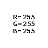
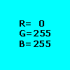
For example, white would be composed of maximum intensity of red, green and blue light (R=255 G=255 B=255) and black would be composed of zero intensity of red, green and blue light (R=0 G=0 B=0). Cyan would be composed of maximum intensity of blue and green light and zero intensity of red light (R=0 B=255 G=255). Magenta would be composed of maximum intensity of red and blue light and zero intensity of green light (R=255 G=0 B=255):
 |  |  |  |
True Color and The CMYK Color Model
Images using the CMYK color model are also true color. CMYK images are derived from the 3 primary colors of cyan, magenta and yellow plus black. In 32-bit CMYK color, each cyan, magenta, yellow and black component is also 8 bits long and has 256 variations in intensity. Each pixel in a 32-bit CMYK image is one of 256 x 256 x 256 possible colors x 256 variations of black. A mix of 100% each of cyan, magenta and yellow produces black, so the black component is extra (more here). Even though there are more bits per pixel in the CMYK model, in reality it has a smaller color "space" or gamut than RGB (more here). Many graphics programs support both color models.
Images which do not define colors in terms of their actual RGB or CMYK values and which derive its colors from a "palette" are known as "Indexed Color". The color palette of an indexed color image has a fixed number of colors. Because the palette is limited to a maximum of 256 colors, it is not possible for an image to look as realistic as it can using RGB or CMYK. Hence, they are not true color. This type of color is known as "Indexed Color" because colors in the palette are referenced by index numbers which are used by the computer to identify each color. Some file formats restrict the number of colors to fewer than 256 . The GIF format is one such format and has a color depth of 8 bits per pixel or less. GIF files use indexed color and allow a maximum of 256 colors. TIFF files can be stored as indexed color or true color. A sample palette is shown below:
| Windows 16 Color Palette with Index Numbers |
Grayscale Images
Grayscale images have a maximum color depth of 8 bits. The reason for this can also be worked out easily. When defining shades of gray in terms of RGB, each of the 3 red, green and blue components must be equal to each other. Examples of grays are R=192 G=192 B=192, and R=128 G=128 B=128. Since all three components must be equal for any shade of gray there are only 256 possible combinations. Thus, grayscale images have a maximum color depth of 8 bits. A complete 256 color grayscale palette is shown in the sample images below.
It is possible to create a grayscale image with a 4-bit color depth or less. Some software packages allow the user to reduce the number of colors in the palette from 256 to 16 or 2, though one would hardly classify a 2-color image as grayscale.
| Note: The palette images below have actual color values in them. If you wish you can download them and save them to your hard disk. |
|
Sample Images | Palettes | |
| | ||
1 bit color:  | 2 color palette: black and white | |
| | ||
1 bit color:  | 2 color palette: blue and white | |
| | ||
4 bit color:  | 16 color palette: Windows 16 color palette used for screen graphics | |
| | ||
8 bit color: 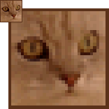 | 256 color palette:   | |
  | ||
| | ||
8 bit grayscale:  | 256 shade grayscale palette:   | |
  | ||
| | ||
24 bit color:  | (No palette used) | |
So far, all that has been described in this article applies to computer displays. But what about printing? What if you want to print a job without using process color? What if you want to print a two or three-color job? What if you want to use a special color ink such as on a company logo? In this case use "spot color". Spot color is the use of pre-mixed colors rather than by combining color from cyan, magenta, yellow and black.
To ensure consistency of color the printing industry has adopted standards for spot color. There are several spot color systems but the most widely used is the PANTONE® system. Pre-mixed colors are selected from swatch books. These same color swatches appear in graphics programs.
When printing a spot color job, it is best to use PANTONE colors to ensure consistency of color. However, you may want to mix your own color for a company logo. In this case have the printer contact his ink sales representative and have the ink company formulate the color for you. This service should cost little or nothing more than the ink itself and can go a long way to establishing that "special image" for your clients.
Many companies use a combination of four color process and spot color in the printing of their product catalogs and sales brochures. The photographs of the products themselves are printed using four color process and the company logo with a standard PANTONE spot color or custom color. This would be a 5-color job. There are many variations on this theme but the basic printing methods are spot and process.
Color Depth
Color "depth" is defined by the number of bits per pixel that can be displayed on a computer screen. Data is stored in bits. Each bit represents two colors because it has a value of 0 or 1. The more bits per pixel, the more colors that can be displayed. Examples of color depth are shown in the following table:
| Color Depth 1 bit color 4 bit color 8 bit color 24 bit color | No. of Colors 2 16 256 16,777,216 | Color Mode Indexed Color Indexed Color Indexed Color True Color | Palette Yes Yes Yes No |
Determining Color Depth
Since each bit represents 2 colors, it is easy to work out the number of colors for the various color depths. The number of possible colors would be 2 to the power of the number of bits per pixel:
A color depth of 4 bits would be 2 times itself 4 times:
2 x 2 x 2 x 2 = 16 colors
A color depth of of 8 bits would be 2 times itself 8 times:
2 x 2 x 2 x 2 x 2 x 2 x 2 x 2 = 256 colors.
A color depth of of 24 bits would be 2 times itself 24 times:
2 x 2 x 2 x 2 x 2 x 2 x 2 x 2 x 2 x 2 x 2 x 2 x
2 x 2 x 2 x 2 x 2 x 2 x 2 x 2 x 2 x 2 x 2 x 2 = 16,777,216 colors
Images are known as "True Color" where each pixel is defined in terms of its actual RGB or CMYK values. Every pixel in a a true color image has 256 possible values for each of it's red, green or blue components (in the RGB model) or cyan, magenta, yellow and black (in the CMYK model). Because there are 256 possible values for each RGB or CMYK component, then RGB true color would have a 24-bit color depth and CMYK true color would have a 32-bit color depth. There are millions of possible colors for each pixel in a true color image. That's why it is called "True Color".
RGB images are derived from the 3 primary colors of red, green and blue. In 24-bit RGB color, each red, green and blue component is 8 bits long and has 256 variations in intensity. These variations are represented in a scale of values ranging from 0 to 255 with 0 having the least intensity and 255 having the greatest. When the 3 components are combined there are 256 x 256 x 256 possible combinations or 16,777,216 possible colors.
For example, white would be composed of maximum intensity of red, green and blue light (R=255 G=255 B=255) and black would be composed of zero intensity of red, green and blue light (R=0 G=0 B=0). Cyan would be composed of maximum intensity of blue and green light and zero intensity of red light (R=0 B=255 G=255). Magenta would be composed of maximum intensity of red and blue light and zero intensity of green light (R=255 G=0 B=255):
| | | |
True Color and The CMYK Color Model
Images using the CMYK color model are also true color. CMYK images are derived from the 3 primary colors of cyan, magenta and yellow plus black. In 32-bit CMYK color, each cyan, magenta, yellow and black component is also 8 bits long and has 256 variations in intensity. Each pixel in a 32-bit CMYK image is one of 256 x 256 x 256 possible colors x 256 variations of black. A mix of 100% each of cyan, magenta and yellow produces black, so the black component is extra (more here). Even though there are more bits per pixel in the CMYK model, in reality it has a smaller color "space" or gamut than RGB (more here). Many graphics programs support both color models.
Images which do not define colors in terms of their actual RGB or CMYK values and which derive its colors from a "palette" are known as "Indexed Color". The color palette of an indexed color image has a fixed number of colors. Because the palette is limited to a maximum of 256 colors, it is not possible for an image to look as realistic as it can using RGB or CMYK. Hence, they are not true color. This type of color is known as "Indexed Color" because colors in the palette are referenced by index numbers which are used by the computer to identify each color. Some file formats restrict the number of colors to fewer than 256 . The GIF format is one such format and has a color depth of 8 bits per pixel or less. GIF files use indexed color and allow a maximum of 256 colors. TIFF files can be stored as indexed color or true color. A sample palette is shown below:
| Windows 16 Color Palette with Index Numbers |
Grayscale Images
Grayscale images have a maximum color depth of 8 bits. The reason for this can also be worked out easily. When defining shades of gray in terms of RGB, each of the 3 red, green and blue components must be equal to each other. Examples of grays are R=192 G=192 B=192, and R=128 G=128 B=128. Since all three components must be equal for any shade of gray there are only 256 possible combinations. Thus, grayscale images have a maximum color depth of 8 bits. A complete 256 color grayscale palette is shown in the sample images below.
It is possible to create a grayscale image with a 4-bit color depth or less. Some software packages allow the user to reduce the number of colors in the palette from 256 to 16 or 2, though one would hardly classify a 2-color image as grayscale.
| Note: The palette images below have actual color values in them. If you wish you can download them and save them to your hard disk. |
|
Sample Images | Palettes | |
| | ||
1 bit color: | 2 color palette: black and white | |
| | ||
1 bit color: | 2 color palette: blue and white | |
| | ||
4 bit color: | 16 color palette: Windows 16 color palette used for screen graphics | |
| | ||
8 bit color: | 256 color palette: | |
| ||
| | ||
8 bit grayscale: | 256 shade grayscale palette: | |
| ||
| | ||
24 bit color: | (No palette used) | |
So far, all that has been described in this article applies to computer displays. But what about printing? What if you want to print a job without using process color? What if you want to print a two or three-color job? What if you want to use a special color ink such as on a company logo? In this case use "spot color". Spot color is the use of pre-mixed colors rather than by combining color from cyan, magenta, yellow and black.
To ensure consistency of color the printing industry has adopted standards for spot color. There are several spot color systems but the most widely used is the PANTONE® system. Pre-mixed colors are selected from swatch books. These same color swatches appear in graphics programs.
When printing a spot color job, it is best to use PANTONE colors to ensure consistency of color. However, you may want to mix your own color for a company logo. In this case have the printer contact his ink sales representative and have the ink company formulate the color for you. This service should cost little or nothing more than the ink itself and can go a long way to establishing that "special image" for your clients.
Many companies use a combination of four color process and spot color in the printing of their product catalogs and sales brochures. The photographs of the products themselves are printed using four color process and the company logo with a standard PANTONE spot color or custom color. This would be a 5-color job. There are many variations on this theme but the basic printing methods are spot and process.
In desktop publishing, when you place type in an EPS file the same fonts must be installed on the computer that will be opening the file as the one where the file was created or else the fonts won't display or print as you intended:
Fonts in EPS files have to be handled the same as fonts in the body text. If you send a job to a service bureau for output then they must have the same fonts on their system - unless you embed the fonts in the EPS file when you first save it. (Currently Deneba Canvas™, Adobe® Illustrator® and CorelDRAW® support font embedding.)
Although EPS files can contain either images or type they are placed in a page layout program as images. Font and style attributes are saved within the EPS file when it is created - such as by an illustration program. Unlike assigning font and style attributes to the body text while working in a page layout program, EPS files are "pre-packaged" with these attributes.
Think of an EPS file as its own little mini-document. When you place an EPS file into a page layout document it is like placing a page layout within a page layout. It is described using PostScript® - the same as the page layout document itself when it is sent to a PostScript device. It is a set of instructions within a set of instructions. Naturally, then, the fonts would be required to properly interpret the instructions within the EPS file.
In QuarkXPress™ you can assign style attributes to TIFF images, but not to EPS files, again, for the same reason that all attributes are assigned using the software that creates the EPS files and not the page layout program.
Let's assume your page layout files will be output by a service bureau either on film or RC (resin coated) paper. Other than font embedding there are a few other ways you could handle this. You could:
1. Supply the fonts along with the job (check first if any licensing agreement applies)
2. Convert all the fonts to curves in the EPS file (but the text will no longer be editable)
3. Save two versions of the EPS file:
a) A master version with editable text
b) A working version (a copy of the master) with text converted to curves
Color and EPS Files
The next point to make about EPS files is that you must be aware of the color model you are using. Is the job going to be printed using spot color or process color? Let's say you will be printing a two-color job - for example, black and red - and it contains an EPS file. If the objects in the EPS file were tagged using process red (a mix of cyan, magenta, yellow and black) and the text in the page layout file was tagged using a spot color or RGB red, depending on the software and colors used, five plates may be output instead of two (four for the process colors in the EPS file and one for the spot color or RGB red in the document).
You must be very specific about how you assign colors in EPS files. The colors assigned to objects in an EPS file must match the colors used in the rest of the document. If the job is to be done using process colors (CMYK), then use process colors in the objects in the EPS file. If the job is to be done using spot colors, then use a standard spot color system such as PANTONE® for both the page layout document as well as the objects in the EPS file. If the job will be a five-color job (process plus spot) such as one using four color for photos and a spot color for a company logo, then make sure the objects in the EPS files use the same spot or process color as the rest of the document.
Always Make Laser Proofs Before
Sending The Job To A Service Bureau
If you will be preparing documents to be output by a service bureau then you should obtain and use a PostScript laser printer to check your output. Make laser proofs before you send the files to be output. The reason is that the service bureau's equipment uses PostScript. By printing a proof using the same page-description language, you will be able to obtain an exact replica before the files are committed to high-end output. Documents containing EPS files must be output to a PostScript device for them to print properly because their instructions are written using PostScript.
If Your Laser Printer Chokes On EPS Files...
There are as many varieties of EPS files as there are applications. Most applications allow EPS files to be saved either as straight ASCII or in binary format to save disk space. Some allow them to be saved using JPEG compression. I personally do not recommend using JPEG compression because it is "lossy" and there will be a trade off between image quality and file size. Some users (including myself) have had the experience of having the laser printer choke on EPS files saved in binary format. Do not become discouraged and not use EPS files believing that all EPS files will cause this. I believe this is caused by the application used to create the EPS files.
If you have trouble this is what I recommend:
1. First check how you send the job to the printer. QuarkXPress has many settings in the print dialog box. You can send images either as ASCII, Clean 8-Bit or Binary. Try variations on these settings first. If this doesn't work, then...
2. Do your image editing and illustration using whatever software you want to use. Save your work as EPS files (for vector or bitmap) or PDF files (for vector only) using any one of them. Then "scrub" them using Adobe Photoshop® (for bitmaps) or Adobe Illustrator (for vector graphics). By "scrubbing" I mean either open the EPS files in one of these two Adobe applications or create new files and use "cut and paste" to get the images into one of these two applications and save them as new EPS files. Then re-import these new EPS files into your page layout documents and output them again. The reason that I have more confidence using an Adobe product to create an EPS file is because EPS files use PostScript and Adobe is the source of PostScript.
What Is "Resolution" and How Do I Use It?
Bitmap images are composed of pixels. Image "resolution" is simply the number of "Pixels Per Inch" (PPI) in the bitmap grid. There are two aspects to every bitmap image - its size (width and height in inches) and resolution (the number of pixels per inch). These two factors alone determine the total number of pixels in an image. For example, a 2 inch by 3 inch image with a resolution of 300 pixels per inch contains (2 x 300) x (3 x 300) or 540,000 pixels.
The more pixels there are in an image, the more detail the image can be displayed with. The fewer pixels there are in an image, the less detail the image can be displayed with. There are two ways to display an image - on screen and in print. When you are preparing images you need to know what resolution to scan or size them to. There is an optimum resolution for each and it is very easy to determine.
First let us take up screen display. This is the easiest to determine. Scan or size them all to 72 PPI. Why? A monitor on a Macintosh system displays at 72 PPI. A monitor on a Windows system displays at 96 PPI. Though there is a difference between the two, the standard for screen displays is 72 PPI. Piece of cake!
Continuous Tones
Determining image resolution for printed output is a little bit different because of the way an image gets printed. A typical photograph like a snapshot or 8 x 10 glossy of your favorite movie star is known as a "continuous tone" photo. It is called a continuous tone because of the gradual changes of tones of color or shades of gray (for black and white photos).
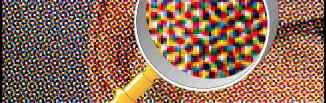
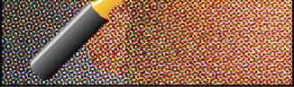
It is not practical to print continuous tones on a printing press so a method was developed to simulate the changes in tone using only black ink for black and white photos. For a photo to be printed on a printing press it must first be converted into a "halftone". A halftone is an image whose continuous tones have been converted to a pattern of solid dots. When viewed as a whole, this pattern of dots appears as a continuous tone, when, actually, it is not.
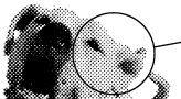 | 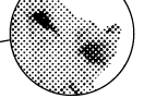 | |
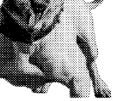 | This grayscale image when printed is really composed of a pattern of dots. |
Using a camera and film, you could take a continuous tone positive and expose a negative with an ordinary window screen positioned between the lens and the film and produce a halftone. The light passing through the screen will diffuse and create the halftone dots. Professional litho houses and printers have been using a method similar to this, although not with a crude window screen. With computer graphics it is done by the software and the printer. You can create your own halftones on a laser printer to get a feel for this.
A halftone is expressed in terms of the "screen frequency" - the number of "Lines Per Inch" (LPI) of the screen used to prepare it. The number of lines per inch is also referred to as the "Line Screen" (LS) of the halftone. Halftones appearing in a typical newspaper range from 65 to 85 line screen. These are coarse halftones because the paper is very porous and rough and requires a larger dot size than the smooth, coated stock used in magazines or brochures. Halftones appearing in magazines, brochures and high quality catalogs typically vary between 133 and 150 line screen.
When preparing images for printed output you must know the screen frequency of the finished halftones before scanning or sizing them. Find out from the printer what is required for the job. There are a lot of variables you need to nail down ahead of time such as the type of paper, the capability of the printing press, what kind of printing plate will be used (paper or metal) and whether the plate will be exposed from a shooting board positive or a film negative.
Once you know the screen frequency of the finished halftone, you can scan and otherwise prepare your images. There is a rule of thumb used in preparing images for printed output. Scan or size images at a resolution (PPI) of 1.5 to 2 times the screen frequency (LPI) of the finished halftone. For example, a 2 inch by 3 inch photo would be scanned or sized to a 2 inch by 3 inch image at 225 to 300 PPI for a finished halftone at 150 LPI (150 line screen). Were the same photo to be printed using a 120 line screen halftone, it would be scanned or sized to 2 inches by 3 inches at 180 to 240 PPI. This is a very workable rule and is easy to remember.
You Determine The Halftone Frequency In The Layout
Once you have prepared your images, you import them into the page layout program such as QuarkXPress™, Adobe® PageMaker®, Corel VENTURA®, Microsoft® Publisher or whatever you are using. In the picture boxes or print dialog you fill in the data fields telling the software what screen frequency to print the halftones. The laser printer or high-end imagesetter uses this information at output time and produces the halftones on paper or film from the digital data. You use grayscale images for black and white halftones and CMYK (not RGB) color images for color separations.
| | More On Halftones: Process Color Halftones And Line Art | Buy Graphics & DTP Software! | ||
| Books on Graphics & DTP | ||||
| Graphics & DTP Training CDs |
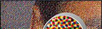
How does the printer or imagesetter create a halftone from a color or grayscale image? The printer creates halftone dots by means of a halftone cell (below). A halftone cell is composed of a grid of pixels. Each pixel would be either solid black or solid white. The number of shades of gray which can be represented by a finished halftone image is limited by the number of pixels available in the halftone cell. Below is an example of a 16 x 16 halftone cell.
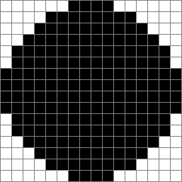
In the example above there are 16 x 16 = 256 possible shades of gray. If all the pixels were black the halftone dot would be 100% black. If all the pixels were white the halftone dot would be 0% black. If every other pixel were black, the halftone dot would be 50% black, etc.
In the above diagram, there are 188 black pixels out of a possible 256 in the halftone cell. The dot would have a grayscale value of 73.4% black.
There is a formula for calculating the maximum screen frequency a printer can output:
![]()
Thus, for a 1200 DPI Linotronic imagesetter, the maximum screen frequency for 256 shades of gray would be 75 and the maximum screen frequency for 64 shades of gray would be 150.
In actuality, though, one can get away with as few as 32 shades of gray in most any image. Thus, for a 150 line screen halftone, you can reduce the number of grays in your images to 64 or less to achieve satisfactory output on a 1200 DPI machine.
Process Color Halftones
Both color and grayscale halftone dots are created as shades of gray. "What?", you say. "Color halftones are shades of gray?" You see, even though the halftone will print using process color, each of the four color plates (cyan, magenta, yellow and black) is prepared from a black and white halftone negative. When printed and combined with their corresponding color, the result would be a color picture (below).
 | |
 |  |
 |
Halftone Angle or "Slope"
Part of setting up the halftone in page layout is determining its angle or "slope". If the halftone were to be displayed with a slope of 0° it would be hard on the eyes. For this reason halftone dots are placed at an angle to each other to blend in better. The dots on a simple grayscale halftone need only be angled at 45°. But the dots on a process color halftone need to be offset from each other in a pattern so they appear harmonious. If you will notice in the representative image above, the cyan, magenta, yellow and black dots appear to form a circular group called a "rosette". The default angles vary with the separation printer selected for output. The default angles for cyan, magenta, yellow and black for a Linotronic 330 are:
| Cyan | 15° |
| Magenta | 75° |
| Yellow | 0° |
| Black | 45° |
Line Art Resolution Rule of Thumb
In the previous tutorial a rule of thumb was given for determining the resolution of a grayscale or color image. It is always better to use an EPS vector image for line art. However, if a bitmap must be used, the rule of thumb for line art is to scan or size it to 600 PPI to avoid the "jaggies". Line art bitmaps have to be scanned or sized at a much higher resolution than color or grayscale halftones.
Desktop publishing (DTP) is generally regarded to have three "legs" or branches - image editing, illustration and page layout. There are many software applications that fall into these categories, but the undisputed leaders of these applications are Adobe® Photoshop®, Adobe Illustrator® and QuarkXPress™. That is the state of affairs as it exists today because these applications are so entrenched in the industry. All responsible instructors will steer students into learning these applications because they want their students to be able to use the tools that are being used.
My purpose in pointing this out is to encourage students and professionals alike to learn these applications and obtain the skills to use them. How I Work - Strategy and Workflow I will tell you how I work. There are other applications that have more "bells and whistles" and some do things faster and easier than these. I will use any and every application I can to make my work easier. Some effects are only possible in certain applications. What I will try to do is learn what exactly each application can and can't do, how well the files port between each other and which features get lost or altered in the process. That takes a lot of experimentation and practice, but the result is that you can plan a workflow in a correct sequence and wind up with a good result. That is the strategy behind how I work. One important point to make about file formats is that if a file format doesn't port well between applications, it's not the format that is at fault. Each software vendor writes or obtains its own import and export filters so the results can be quite unpredictable. Bitmap Images The Photoshop PSD format is widely supported and ports between most applications easily. However, I avoid using editable text layers until last when I finish the image in Photoshop. Most bitmap formats (TIFF, PCX, BMP, etc.) port without a hitch but I prefer the PSD format because it supports layers. On the PC I use Paint Shop Pro™ for all the screen shots (on the Mac® I use Snapz Pro™ 2). I'll save them as Photoshop PSDs on both platforms. Cropping is fast and easy, I can copy and paste rectangular selections quickly and I prefer it over Photoshop for bitmap editing of GIF files. Vector Images Most applications will port generic vector EPS with no problem as long as there are no gradient fills and the image uses solid colors for strokes and fills. There are a lot of clipart images in WMF (Windows® Meta File) format. This format does not support Bezier curves. All "curves" in these files are composed of short, straight line segments. I will use Macromedia® FreeHand® to simplify the paths in these files and convert the straight segments to curves. CorelDRAW® would be my second choice for that job. Now even Canvas 7 has a tool this. A plug-in for Adobe Illustrator 8 called "Smart Remove Points" from BeInfinite, Inc. is available for the Mac. If the application only supports Windows metafiles I prefer to use the EMF (Enhanced Meta File) format over the WMF format because it supports Bezier curves. I have also found that there is wide support for Adobe Illustrator version 7 and that format ports quite well. Even some versions of the CorelDRAW format port well also. I try to avoid passing gradient fills between applications and certainly not any of the special strokes or patterns. I will save those for the final application used to produce the image or composition. Images With Clipping Paths As a rule I use Adobe Acrobat® PDF format for porting masked bitmaps between illustration programs. Sometimes EPS images with clipping paths will port with the mask and bitmap intact, but not always. Sometimes the Adobe Illustrator 7 format will work for this purpose. I will always make the final image with a clipping path as an EPS and I will use Photoshop to create the file. Sometimes I will use Illustrator, though. The reason I use an Adobe product to create an EPS file is because EPS files are PostScript® (Encapsulated PostScript) and Adobe is the source of PostScript. I know I can count on a clean file if I do. Desktop publishing (DTP) is generally regarded to have three "legs" or branches - image editing, illustration and page layout. There are many software applications that fall into these categories, but the undisputed leaders of these applications are Adobe® Photoshop®, Adobe Illustrator® and QuarkXPress™. That is the state of affairs as it exists today because these applications are so entrenched in the industry. All responsible instructors will steer students into learning these applications because they want their students to be able to use the tools that are being used.
My purpose in pointing this out is to encourage students and professionals alike to learn these applications and obtain the skills to use them. How I Work - Strategy and Workflow I will tell you how I work. There are other applications that have more "bells and whistles" and some do things faster and easier than these. I will use any and every application I can to make my work easier. Some effects are only possible in certain applications. What I will try to do is learn what exactly each application can and can't do, how well the files port between each other and which features get lost or altered in the process. That takes a lot of experimentation and practice, but the result is that you can plan a workflow in a correct sequence and wind up with a good result. That is the strategy behind how I work. One important point to make about file formats is that if a file format doesn't port well between applications, it's not the format that is at fault. Each software vendor writes or obtains its own import and export filters so the results can be quite unpredictable. Bitmap Images The Photoshop PSD format is widely supported and ports between most applications easily. However, I avoid using editable text layers until last when I finish the image in Photoshop. Most bitmap formats (TIFF, PCX, BMP, etc.) port without a hitch but I prefer the PSD format because it supports layers. On the PC I use Paint Shop Pro™ for all the screen shots (on the Mac® I use Snapz Pro™ 2). I'll save them as Photoshop PSDs on both platforms. Cropping is fast and easy, I can copy and paste rectangular selections quickly and I prefer it over Photoshop for bitmap editing of GIF files. Vector Images Most applications will port generic vector EPS with no problem as long as there are no gradient fills and the image uses solid colors for strokes and fills. There are a lot of clipart images in WMF (Windows® Meta File) format. This format does not support Bezier curves. All "curves" in these files are composed of short, straight line segments. I will use Macromedia® FreeHand® to simplify the paths in these files and convert the straight segments to curves. CorelDRAW® would be my second choice for that job. Now even Canvas 7 has a tool this. A plug-in for Adobe Illustrator 8 called "Smart Remove Points" from BeInfinite, Inc. is available for the Mac. If the application only supports Windows metafiles I prefer to use the EMF (Enhanced Meta File) format over the WMF format because it supports Bezier curves. I have also found that there is wide support for Adobe Illustrator version 7 and that format ports quite well. Even some versions of the CorelDRAW format port well also. I try to avoid passing gradient fills between applications and certainly not any of the special strokes or patterns. I will save those for the final application used to produce the image or composition. Images With Clipping Paths As a rule I use Adobe Acrobat® PDF format for porting masked bitmaps between illustration programs. Sometimes EPS images with clipping paths will port with the mask and bitmap intact, but not always. Sometimes the Adobe Illustrator 7 format will work for this purpose. I will always make the final image with a clipping path as an EPS and I will use Photoshop to create the file. Sometimes I will use Illustrator, though. The reason I use an Adobe product to create an EPS file is because EPS files are PostScript® (Encapsulated PostScript) and Adobe is the source of PostScript. I know I can count on a clean file if I do. | ||||||||||||||||||||||||||||||||||||||||||||||||||||||||||||||||||||||||